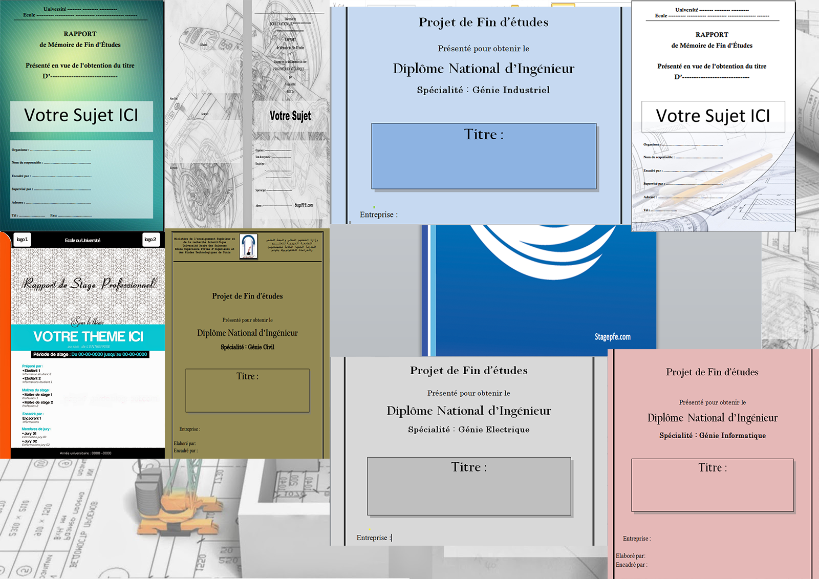
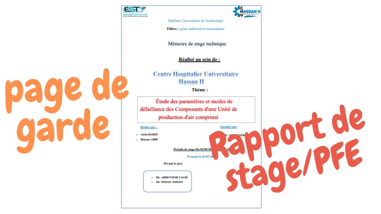
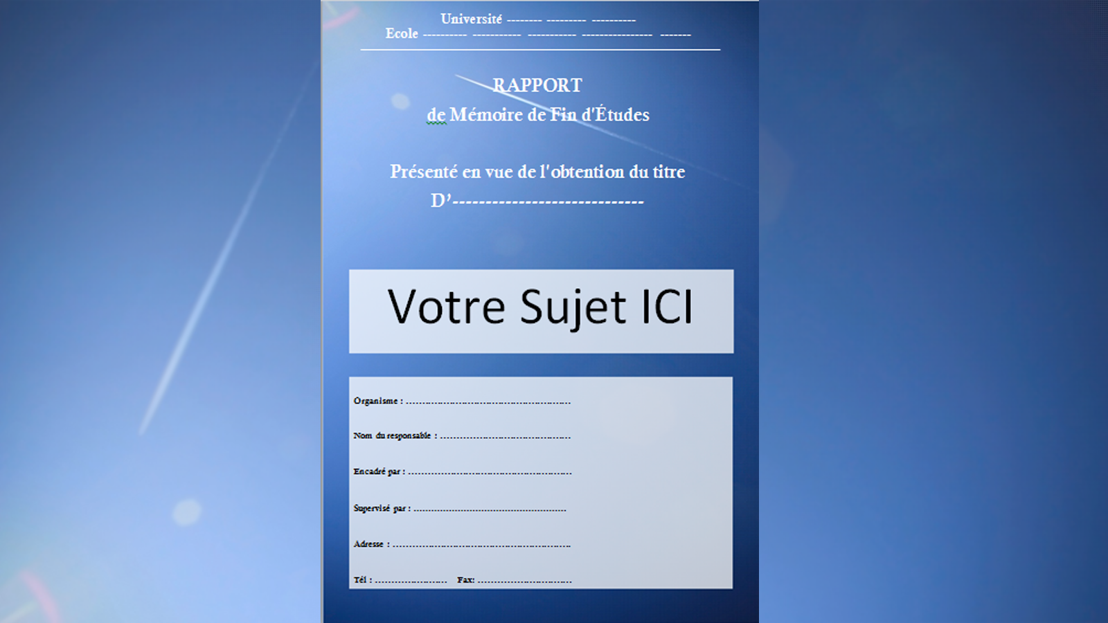
Ah, la "Page de Garde." This unassuming piece of paper, often relegated to the first page of a mémoire or a meticulously prepared dossier, carries more weight than you might think. It's not just about listing your name and the title; it's your first impression, your handshake, the "Bonjour" that sets the tone for everything that follows. Think of it as the little black dress of academic documents – simple, elegant, and oh-so-important to get right.
Pourquoi s'en soucier?
You might be thinking, "Seriously? All this fuss about a cover page?" Mais oui! Here's why you should care:
- Professionalism: A well-designed page de garde shows you take your work seriously. It screams, "I've got my act together!"
- Clarity: It provides essential information at a glance, making it easy for your professor or client to identify your work. No guessing games!
- Branding (sort of): It's an opportunity to subtly inject your own style and personality. A touch of design flair can go a long way.
- It's expected: In many academic and professional settings, a page de garde is simply de rigueur. Don't be the person who forgets their homework.
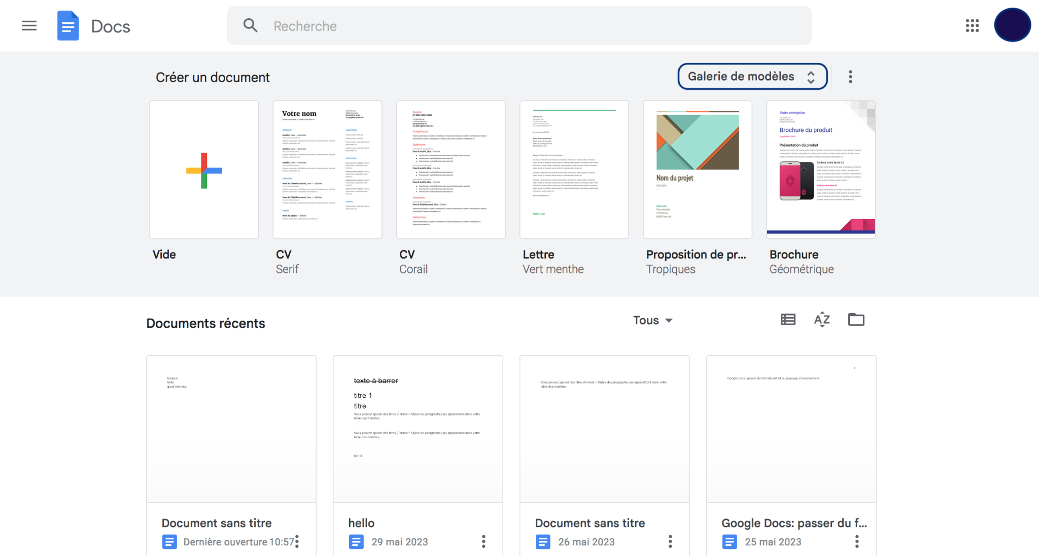
Éléments Essentiels: The Must-Haves
So, what exactly needs to be on this magical page? Think of it as your informational bread and butter:
- Your Name: Obvious, right? But make sure it's spelled correctly and consistently!
- The Title of Your Work: Clarity is key. Avoid overly long or vague titles. Think of it as crafting the perfect tweet – concise and impactful.
- The Course Name (if applicable): For university assignments, this is a must.
- The Professor's Name (if applicable): Show respect to your instructor. Monsieur/Madame is a nice touch.
- The Date: Important for tracking and organization.
- Your Student ID (if applicable): Check your university's specific requirements.
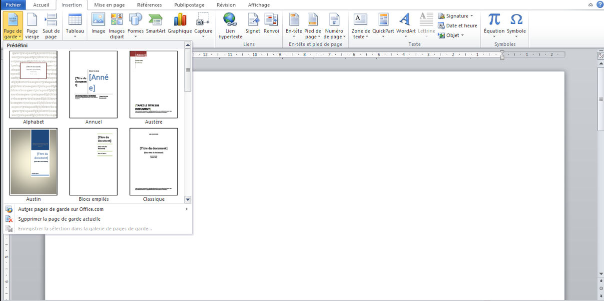
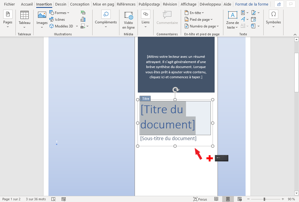
Un Peu de Style: Adding Your Personal Touch
While adhering to the essential elements, you have some wiggle room to inject your own style. Think of it as adding a scarf to your little black dress. A few pointers:
- Font Choice: Stick to classic, readable fonts like Times New Roman, Arial, or Calibri. Avoid anything too fancy or distracting. Think "Parisian chic," not "circus performer."
- Layout: Experiment with the placement of elements. Consider centering the text or using a more asymmetrical design. Online tools like Canva offer user-friendly templates.
- Color (Sparingly): A subtle use of color can add visual interest. But be careful not to overdo it. A single, muted accent color is often enough. Think of the carefully curated color palette of a Wes Anderson film – intentional and balanced.
- Logos (If Applicable): If you're submitting the document on behalf of a company or organization, include their logo.
Les Pièges à Éviter: Common Mistakes
Even with good intentions, it's easy to make a few common mistakes. Here's what to watch out for:
- Typos: Proofread, proofread, proofread! Nothing undermines your credibility like a glaring typo on the first page. Ask a friend to double-check.
- Inconsistency: Make sure the information on your page de garde matches the information in your document.
- Too Much Clutter: Keep it clean and simple. Avoid unnecessary graphics or distractions.
- Ignoring Instructions: Always, always follow the specific instructions provided by your professor or client. They usually know best.
Petite Réflexion: Page de Garde in Real Life
The page de garde might seem like a small detail, but it reflects a broader principle: attention to detail matters. Whether you're crafting a cover page, preparing a presentation, or even just writing an email, taking the time to do it right can make a world of difference. It's about showing that you care, that you're committed, and that you're willing to go the extra mile. So, next time you're faced with creating a page de garde, embrace the opportunity to make a positive first impression. Bonne chance!