Okay, imagine this: you're at a flea market, right? Surrounded by dusty treasures and questionable smells. You spot a beautiful, old leather-bound book. Intrigued, you reach out, flip it open... and BAM! A scribbled-over mess on the first page. Ugh. All that potential, ruined! That, my friends, is the opposite of a good page de garde. (En français, s'il vous plaît!)
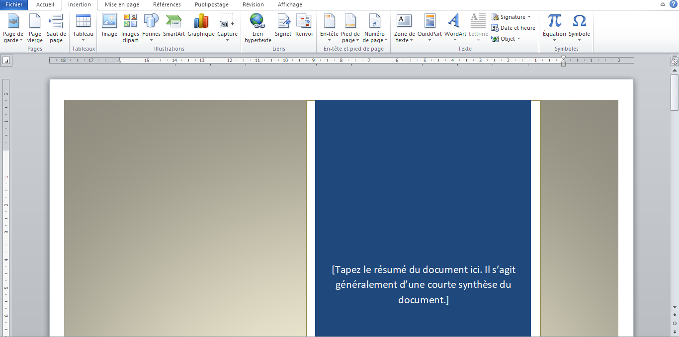
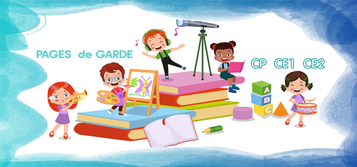
So, what IS a page de garde, exactly? Well, think of it as the book's first impression. It's the ceremonial "Hello, I'm about to be amazing (hopefully)!" It's not just a blank sheet of paper; it's an opportunity. And trust me, opportunities should never be wasted, especially not in the design realm.
Why Bother with a Page de Garde?
Seriously, in our digital age, who even cares about a fancy title page? Well, you should! Here's why:
- Professionalism: Whether it's a thesis, a business report, or even just a super-organized recipe book (we all have one, right?), a page de garde instantly elevates the look. Think of it as wearing a blazer to a Zoom meeting – you might not need it, but it shows you mean business.
- Branding: For companies, it's a chance to reinforce your visual identity. Logo, colors, font – all strategically placed to make a statement. It's subliminal messaging at its finest! (They'll never know what hit 'em!)
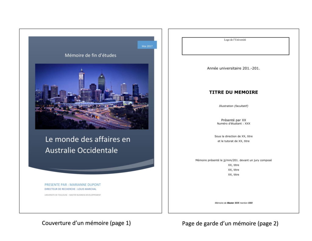
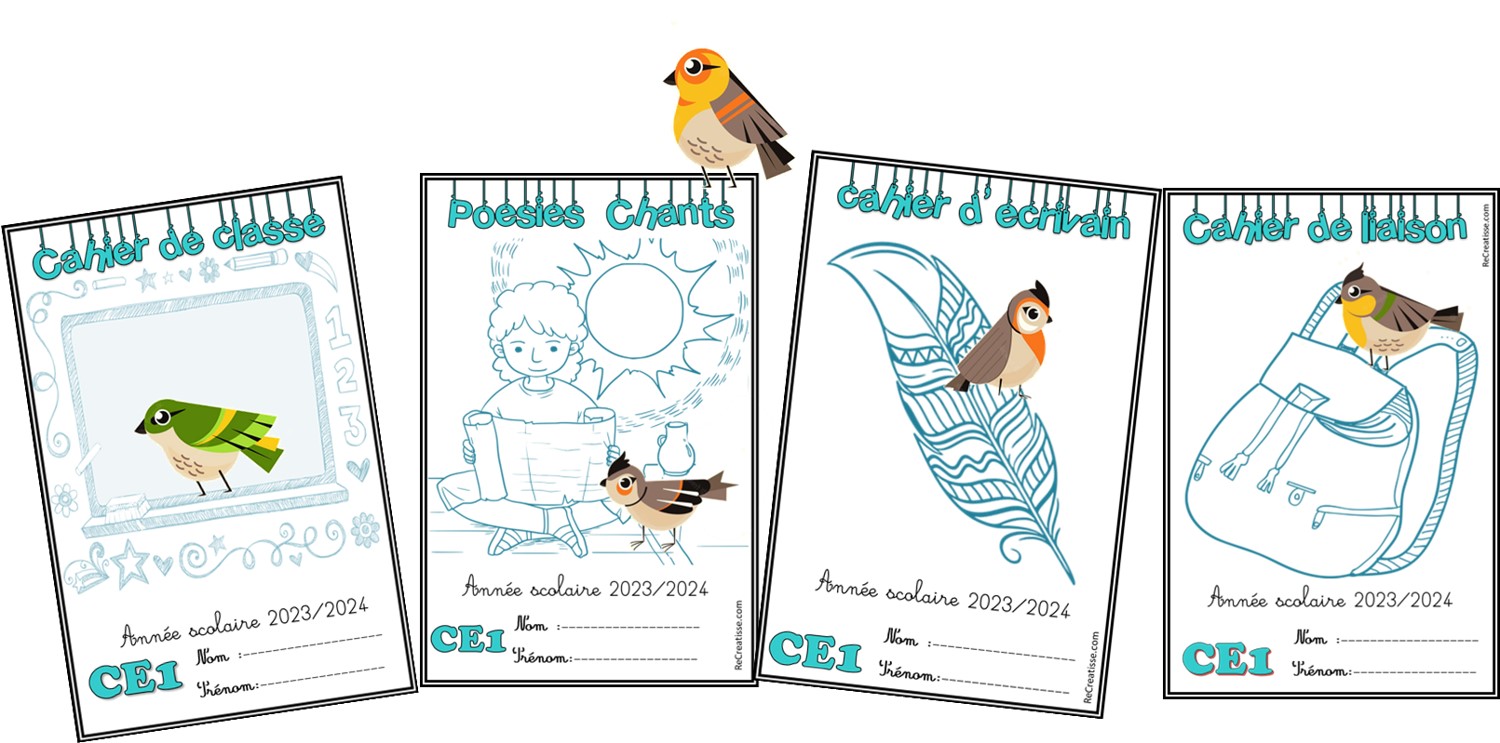
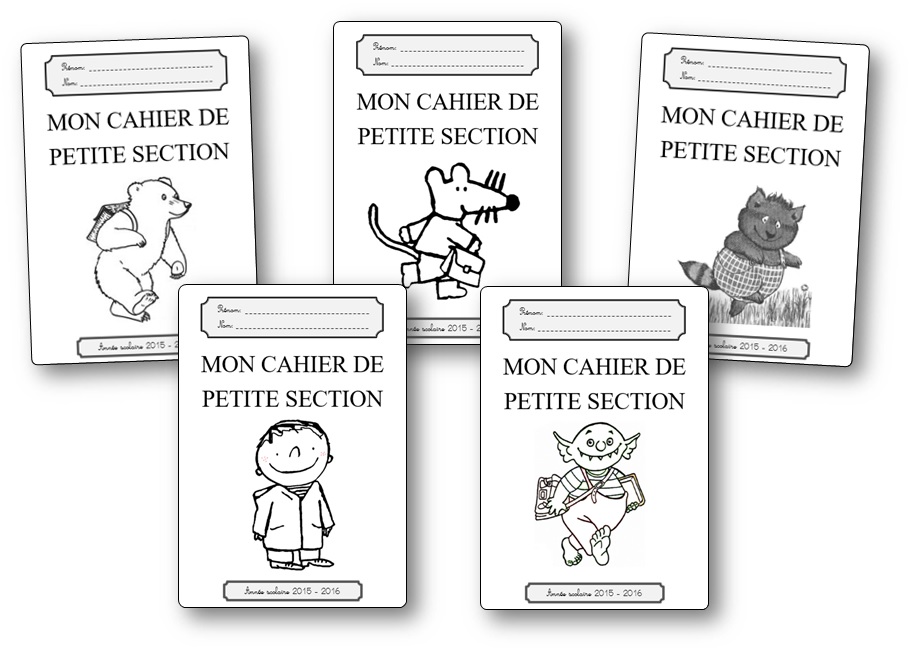
- Clarity: It clearly presents the title, author, date, and any other relevant information. No more squinting and guessing! Think of it like a really good map before embarking on a literary journey.
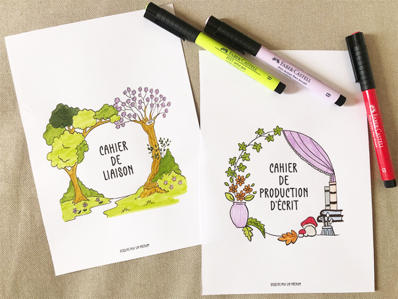
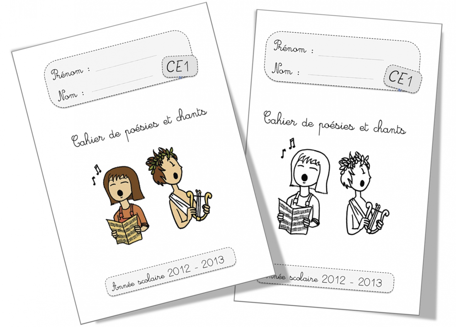
- Aesthetic Appeal: Let's be honest, a well-designed page de garde is just plain pretty. It adds a touch of class and makes the reader feel like they're about to experience something special. (Because, presumably, they are!)
What to Include (and What to Avoid)
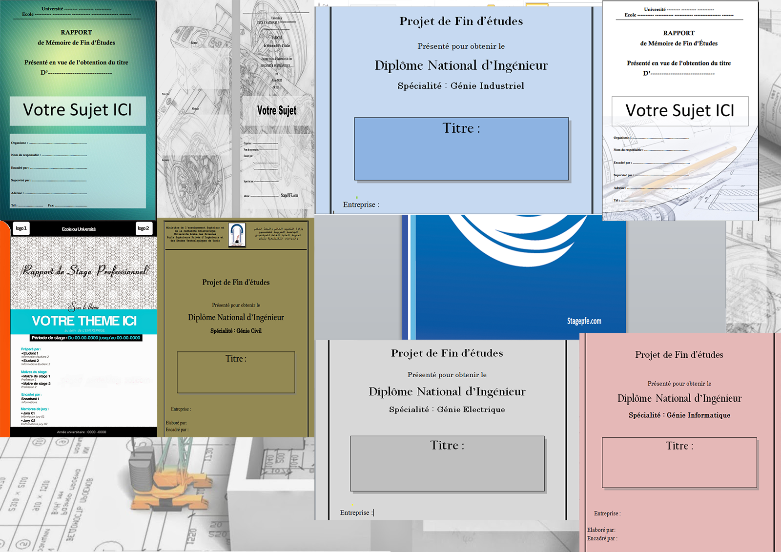
Alright, so you're sold on the idea. But what goes on this magical page? Here are some essentials:
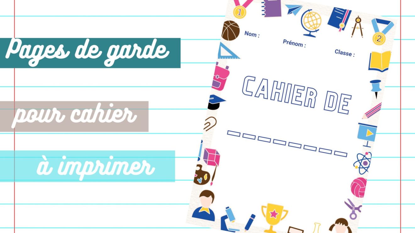
- The Obvious: Title, subtitle (if applicable), author's name. Obvious, right? But you'd be surprised!
- Date: Super important, especially for academic or professional documents. Nobody wants to read outdated information.
- Institution/Company: If it's a thesis, include the university. If it's a report, include the company name. You get the idea.
- Logo: If you have one, use it (tastefully, of course!).
And here's what to AVOID:
- Clutter: Keep it clean and simple. Don't overload the page with unnecessary information or distracting graphics. Remember, less is often more.
- Bad Typography: Choose a font that's easy to read and aesthetically pleasing. Comic Sans is NEVER the answer. (Seriously, never!)
- Low-Resolution Images: Blurry logos and pixelated graphics are a big no-no. Make sure everything is crisp and clear.
- Grammatical Errors: Proofread, proofread, PROOFREAD! Nothing screams "unprofessional" like a typo on the first page.
Final Thoughts
So, the next time you're creating a document, don't overlook the humble page de garde. It's a small detail that can make a big difference. It's your chance to make a positive first impression and set the stage for a great reading experience. Now go forth and design! (And maybe burn that flea market book. Just kidding… mostly.)